Manifest Medex

Manifest Medex - Rebrand
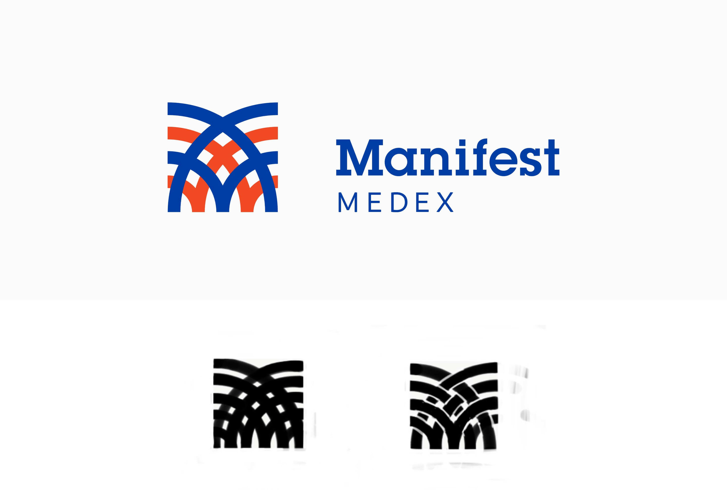
Being in a highly competitive healthcare space, Manifest Medex, had a deep need for a re-brand. The new logo needed to be strong and simple, yet still unique. The new form is made from concentric circles overlapping one another to create a sense of inter-connectivity, which made sense for a healthcare data company. The circular forms were then cropped within a square revealing the "M" letter form.
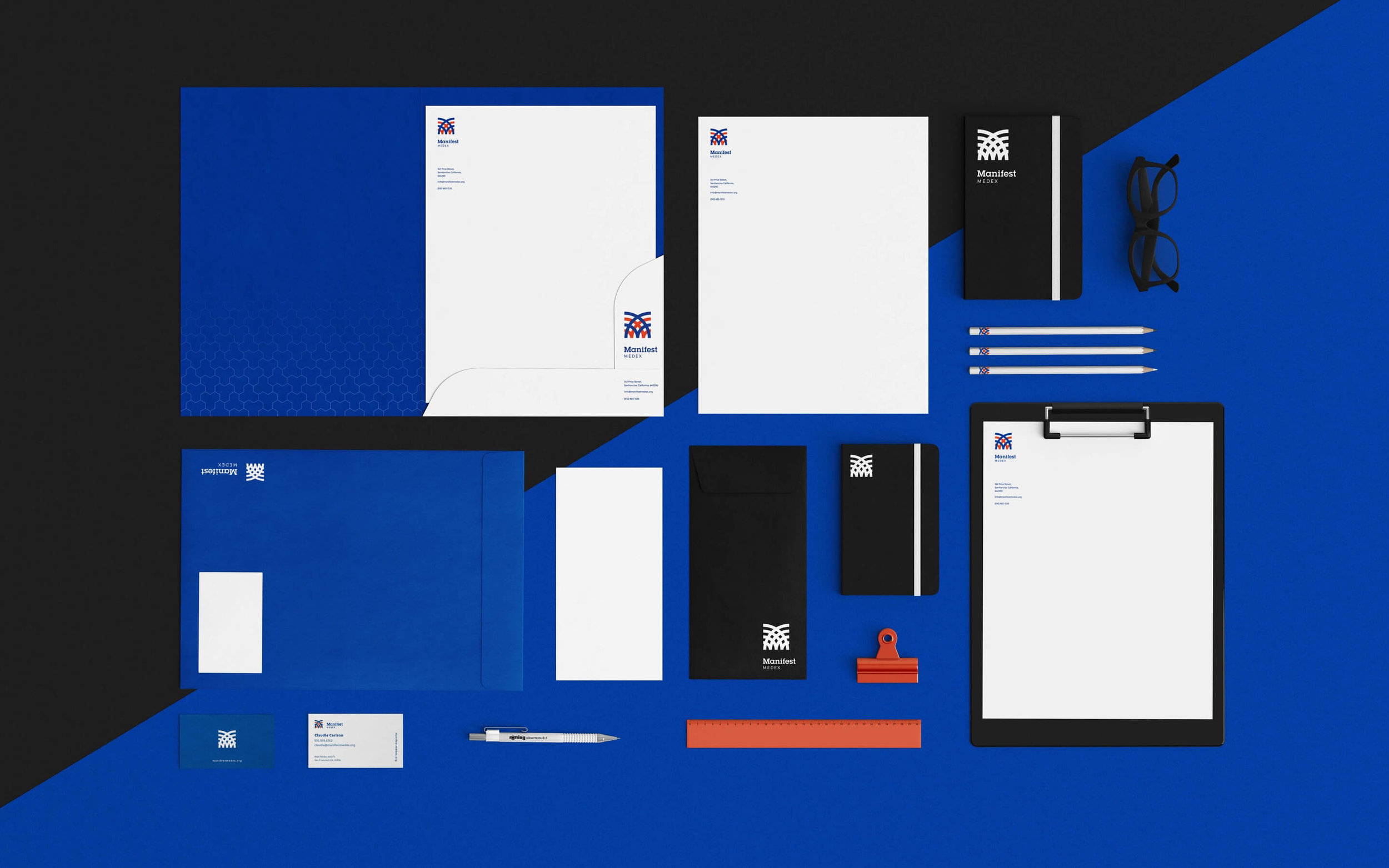
This new brand was then implemented into all their traditional and digital media.
Client: Manifest Medex
Agency: This Is Big
Role: Art Direction/Design


